Tasty New Identity
Client: Emma Condor and Helen Quinn
I was asked to look at designing a new identity for a start up which aims to help mother's through the weaning process.
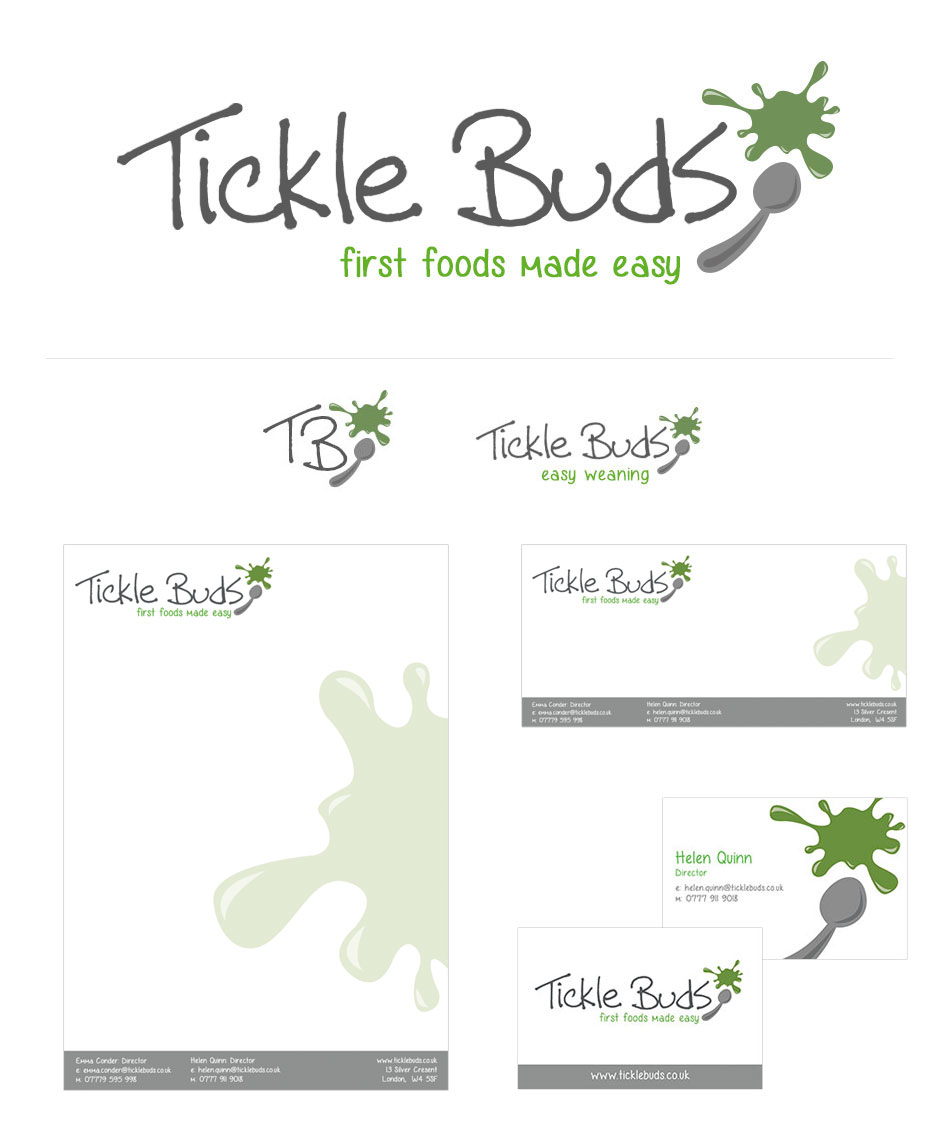
A Tasty Design Job
The task of creating an identity that needed to show the four different stages of weaning as well as being strong enough on it's own was a lot of fun. As the company dealt with food the colours needed to be reflected of food. Using green for the main logo was an easy choice as every first stage recipes seem to be green, avocado, cucumbers and mashed up veg any parent who has weaned a baby knows this.
The splat on the logo with the spoon was at first meant to be a bit of fun and a nice way to illustrate the mess that comes with the weaning process but it actually lends itself later on as the brand evolved to holding the weaning stage numbers very well.
Four stages and four brand colours
The new logo with the colours being inside the splat and secondary text really allowed itself to be used to show the four other stages of weaning.
A colourful way to show the four stages
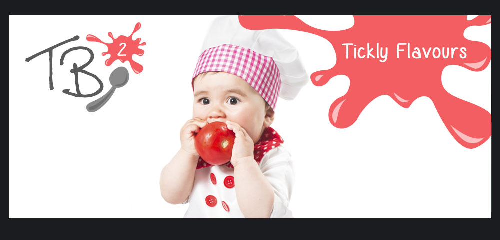
The smaller version of the logo allows the stage number to be shown and the colourful splat is a great device to hold text and help a user know which stage they are looking at. The need to show babies is also important in taking the brand forward after all they are so cute!
