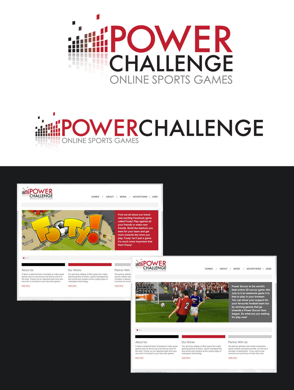
New logo and game identity
Client: Power Challenge ABDate: Jan 2011
I worked for Power Challenge and whilst I was looking at improving the UX for their Facebook game Footy! and updating their online game Manager Zone with a new brand, I designed this new corporate identity.

An updated identity
The main idea behind updating the parent logo for Power Challenge was to create a corporate website to entice partnership and raise some money to improve the football games.
I wanted the logo to suggest gaming but not reflect the specific sports games the company makes. However the idea behind the squares came from illustrating a score board for one of the games extra features. I decided on the colours red and black because they aren't associated with any particular sport which helps separate again the parent company from the sports games it produces.