New corporate identity
Client: FreelanceDate: Jan 2011
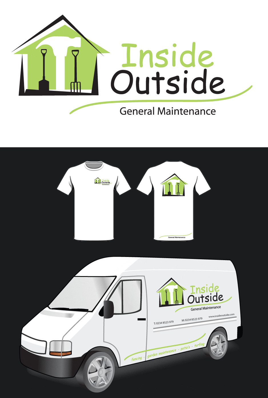
I was approached by a small business from Dymchurch to create a new logo for a general maintenance company that took on all types of jobs inside and outside.

A new corporate identity
This logo is by far the hardest logo I have ever been asked to do. At first glance it looks a simple design but when I ask you to think about the brief I was given you may appreciate the design a bit more. The brief was to illustrate 'inside' and 'outside'.
Now how to go you go about doing this? The tools obviously helped and I tried a lot of different ideas before finding this one.
The depth of the logo is the main reason this design works. The 'inside' is illustrated with the green basic house shape and the silhouette shape of the hammer. The 'outside' is represented by angular lines that frame the house representing a roof and a garden. The silhouetted garden spade and fork emphasis this and by off setting these more to the left and by using the colour black this allows the green house visually feel deeper.
Overall I am very pleased with this design and I took great pleasure in seeing the logo on a white van being driven around Dymchurch in Kent.