Logo Redesign
Client: Power Challenge ABDate: Nov 2011
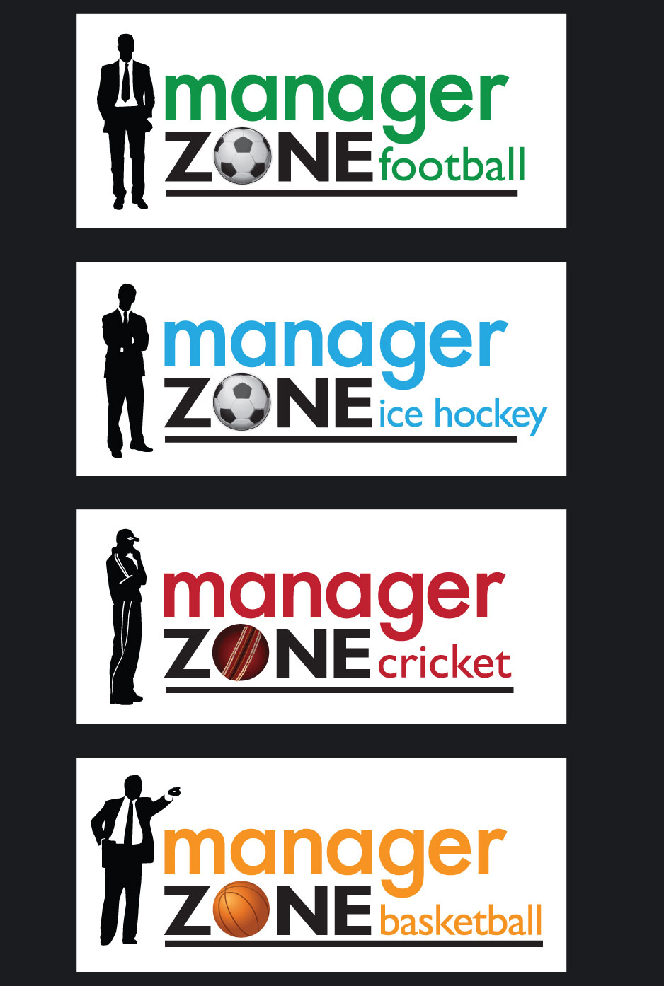
I worked for Power Challenge concentrating on improving the UX and UI for their online game Manager Zone. Whilst designing and updating the user experience and listening to the ambitions of the company I decided a new logo should also be looked at.

New Identity
The manager silhouette was a pivotal part of the new branding and using the idea that a whilst playing the game the player was putting themselves into the manager's shoes.
Using the 'O' of the word Zone allowed another visual aid to highlight the individual sports and to also tie all the logo's together from a design consistency point of view.
The individual colours also reflect the main colour associated with the sports: green for the grass pitches used in football, blue for the ice in ice hockey, yellow for the court in basketball and red for the colour of the famous Kookaburra cricket ball. These main colours were used throughout the designs of the online games as highlight colours.
A Flexible Identity
The redesign of the logo and idea of the silhouette manager was going to be used as the game expanded into other sports including cricket and basketball.

Icon Design
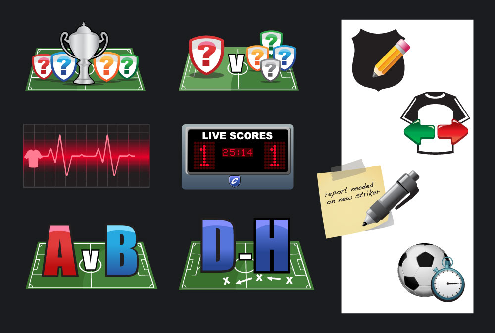
A fun aspect of this job was to create a look and feel for all the different game features Manager Zone supported. These included club trophy competitions, league competitions, player monitoring, live score features, tactical game features as well as the ability to edit your club badge, transfer players, get scout reports and start games instantly.
All of these icons were created with Adobe Illustrator.

