E4 homepage
Client: Channel 4
Redesigning the E4 homepage
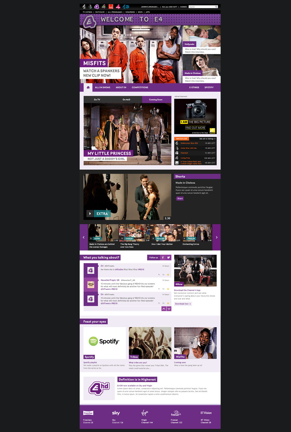
Working with the design agency Numiko, we designed a new homepage for E4 to accommodate a new brand launch and move the site on to a new internally built CMS system.
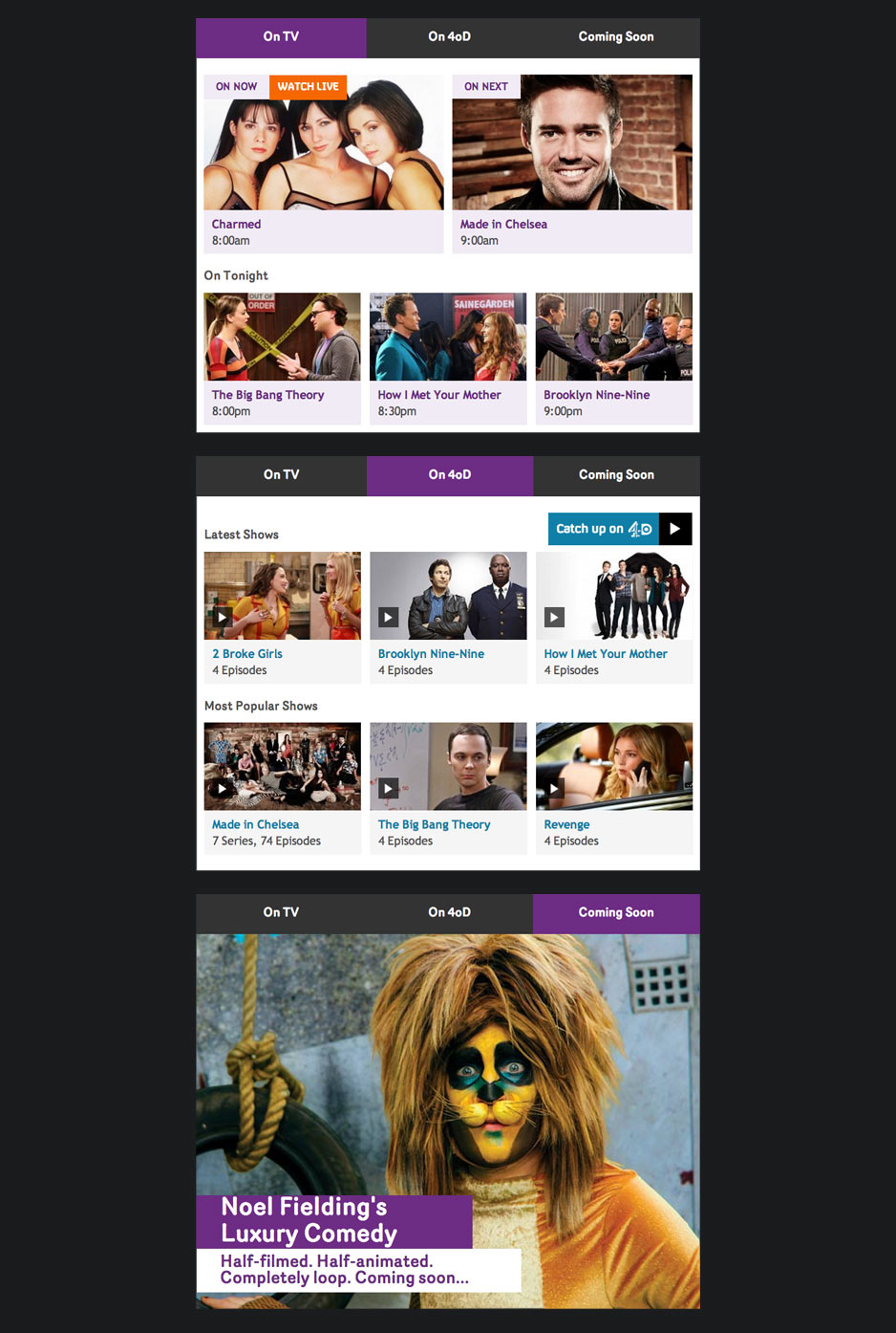
The main feature of the page was a timeline style widget which allowed users to see what was currently on E4, what was available to watch on 4oD and what was coming up in the future. Numiko came up with this concept and I created the final designs.
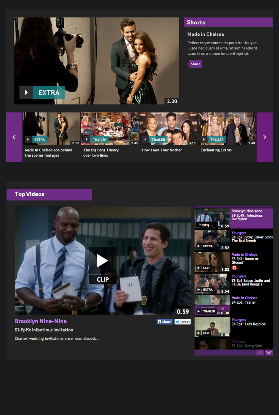
Another element of the page I redesigned once the page was live was the video carousel slice. The old slice was functionally fine but I felt using a horizontal scroll as we did with the short form player on E4 was a better design especially as the controls were close together so easier to use than the large side paddles.
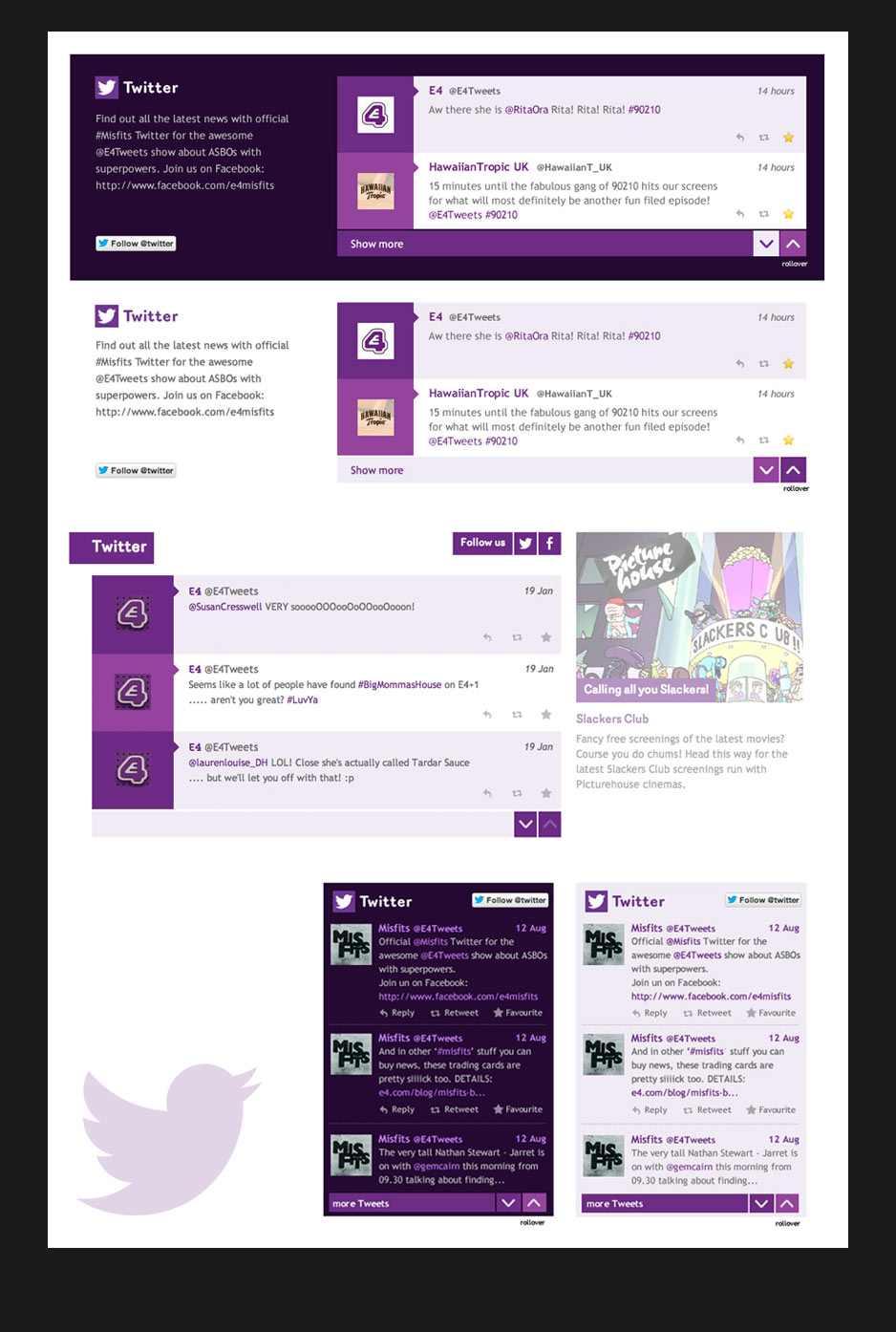
With the younger audience of E4 taken into consideration and the popularity of Twitter a social slice was a main part of the new homepage. I had to come up with a few different sized versions of this slice so it was flexible enough not only to work on this page but any brand pages too. The slice was designed to fit across three, two and one columns.
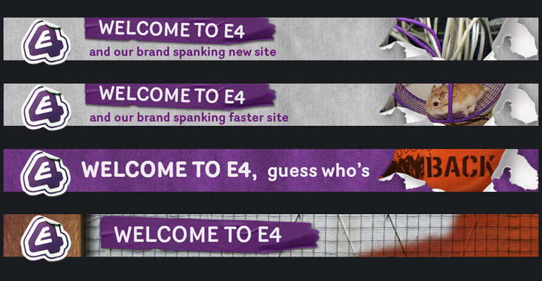
Header options
The launch of the new homepage was a few weeks before E4 changed it's on-air branding and logo treatment style. One of the fun things about this job was to design a few options for the top header. Unfortunately none of these banners were used, a plain purple strip was decided on but it was still fun to design them with E4's cheeky tone of voice.
