A responsive internship website
Client: Channel 4Date: May 2014
Designing a responsive website
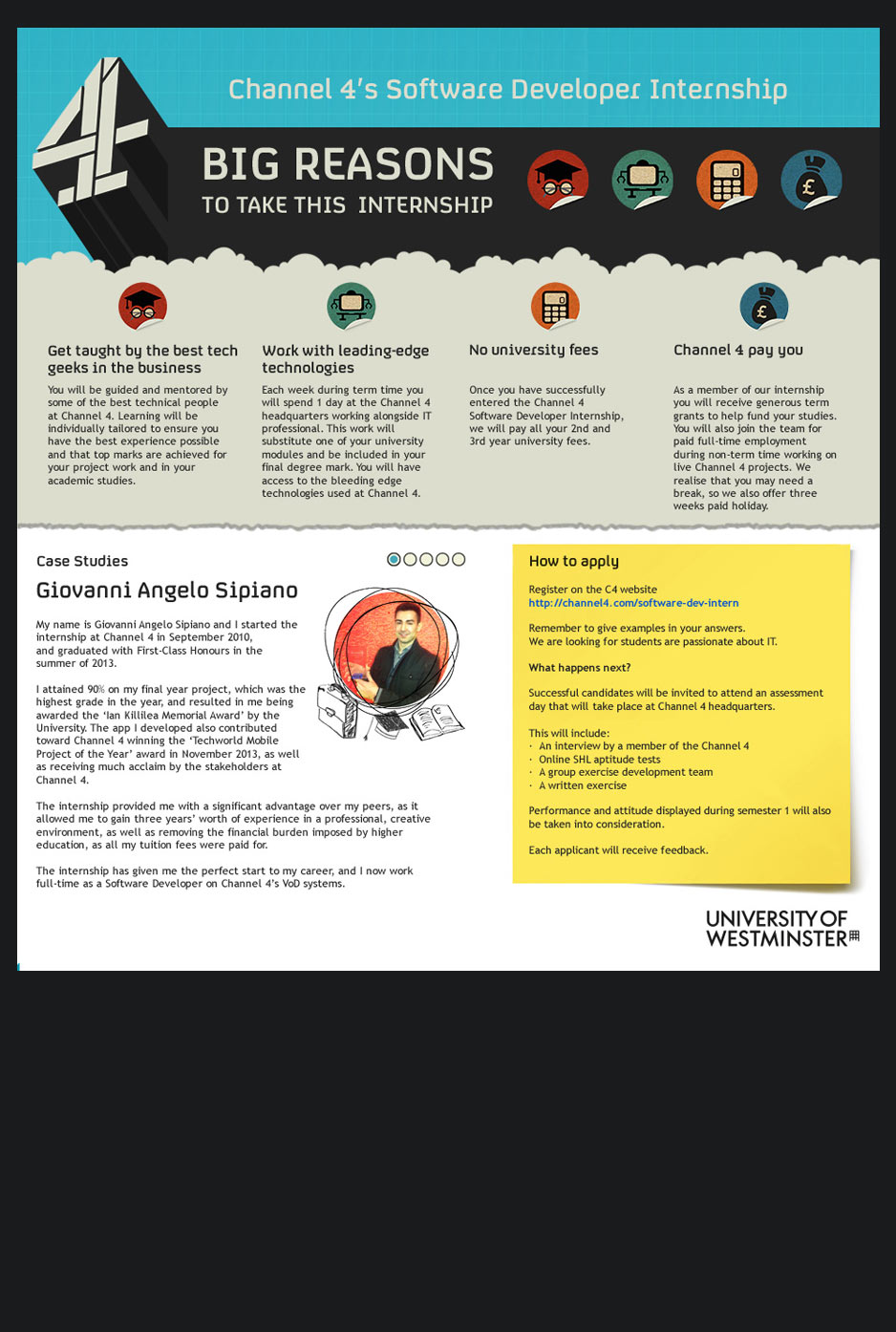
I was given a brief to design a website to advertise Channel 4's Software Developer Internship
There was a supporting poster to take the blue background style from but the rest was left to me to design.
I came up with the idea of the cloud shaped background to hold the four main reasons to take this internship from idea thought bubbles and a dream like quality to represent how good this opportunity is. It also worked well with the blue theme of the poster.
I wanted to illustrate the four main points clearly so I decide iconography would be the best way highlight these advantages. The first two were a bit of challenge but overall I am very pleased with how they turned out.
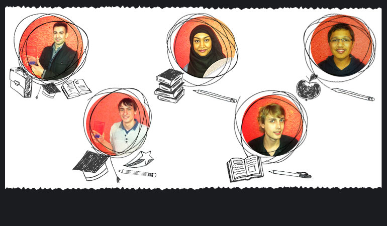
The case study section needed to feel a bit more real so I used the idea of torn paper to write all the student information of successful internship candidates.
The large post it note was a easy and recognisable element which helps the important information of how to apply stand out more especially with the curved edges. This allows this section to be lifted off the rest of the flat design.
Supporting graphics
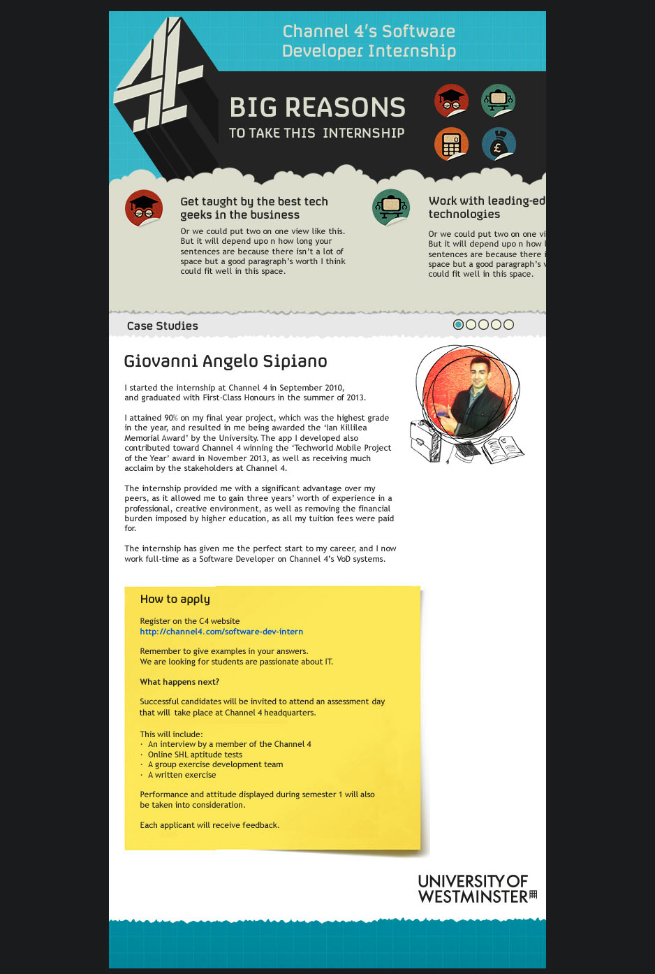
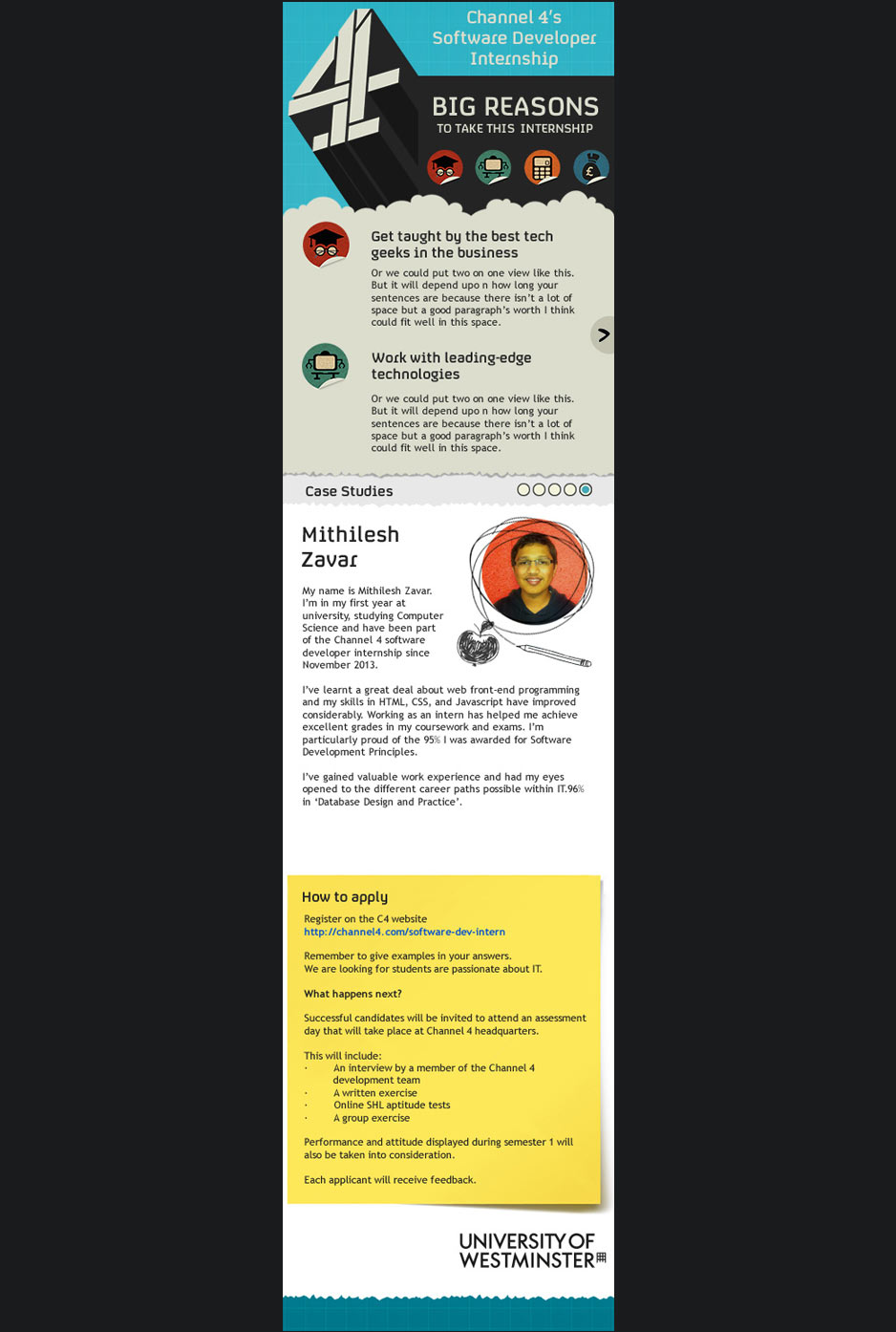
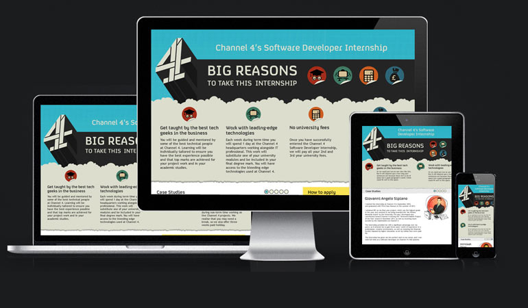
The target audience for the website is obviously students so the site had to be responsive as most 18-25 years have internet primarily on their phones.
One of the harder aspects of this job was to design the iconography especially for 'working with leading-edge technologies' but I am happy with the final designs. Who wouldn't want a robot laptop!
I wanted to give the individual students a visual reflection of where they are in the internship. I decide to use hand drawn icons for a more personal feel to do this.
