4oD Redesign
Client: Channel 4
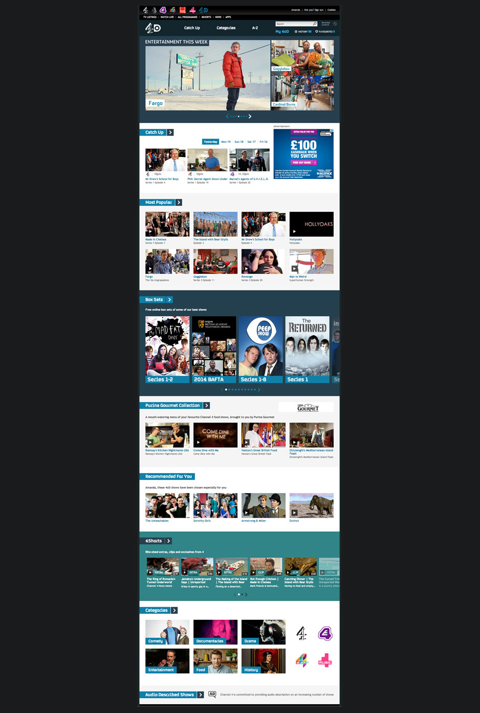
An updated design for the 4oD homepage
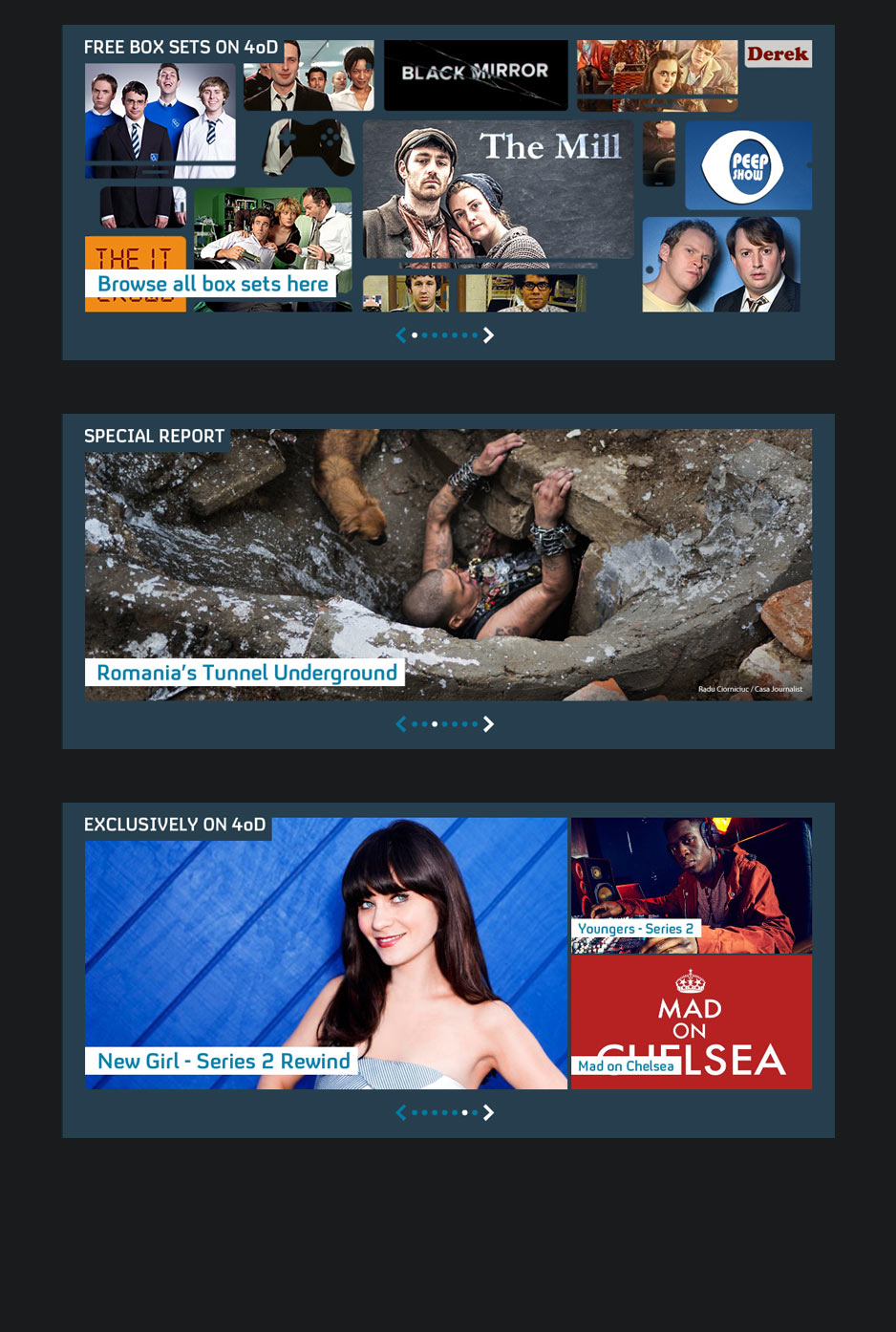
The biggest change was the introduction of a multiple boxed carousel. The carousel and the fact it automatically scrolled allowed users to see the depth of content 4oD has to offer. Using two styles, one main image and a grid split into three, the carousel is flexible for all marketing needs and keeps a user interested with the visual differences.
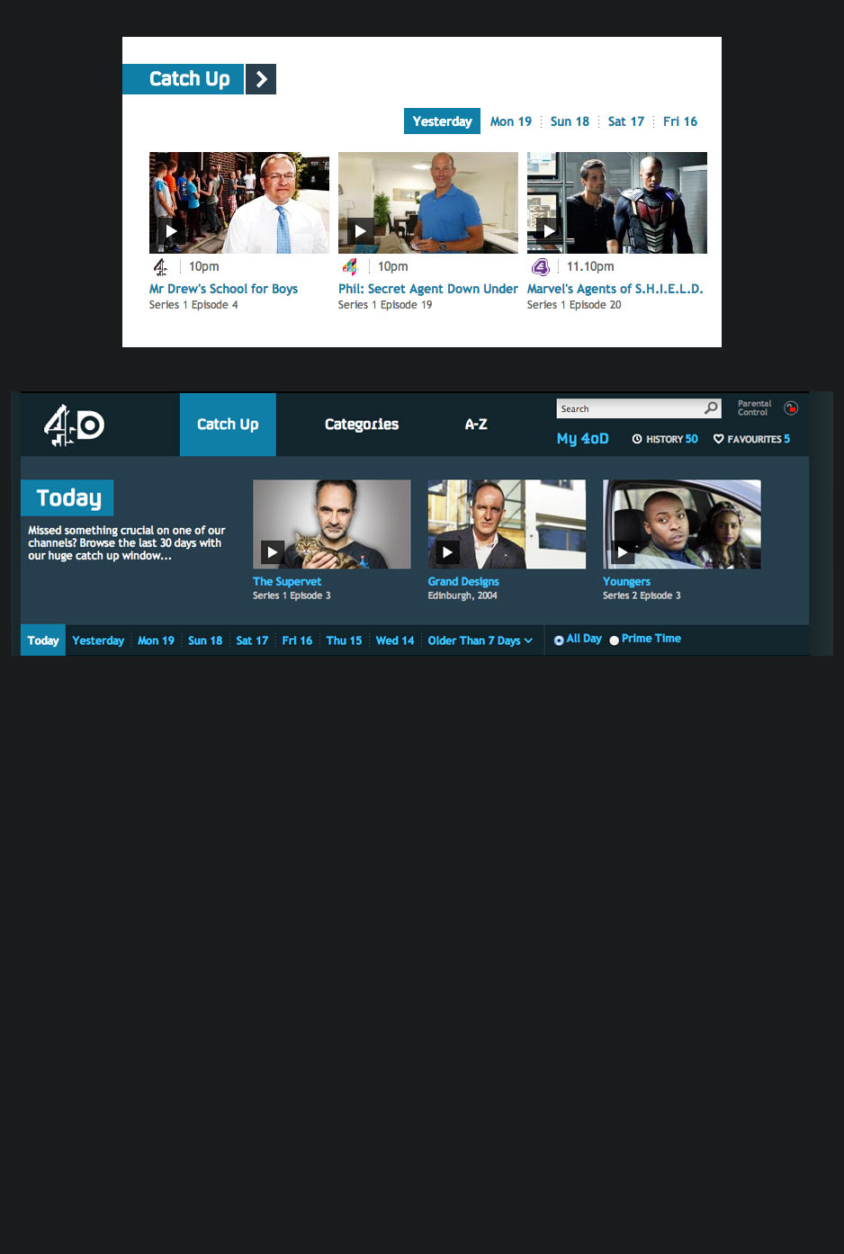
4oD has a 30 day catch up policy that currently stands it apart from the iPlayer. We want to try and highlight this catch up service by showing the last five days and providing a direct link into the Catch Up area of the site. The design of the Catch Up page was also updated removing the old style gradients with a new flatter design to match that of the homepage.
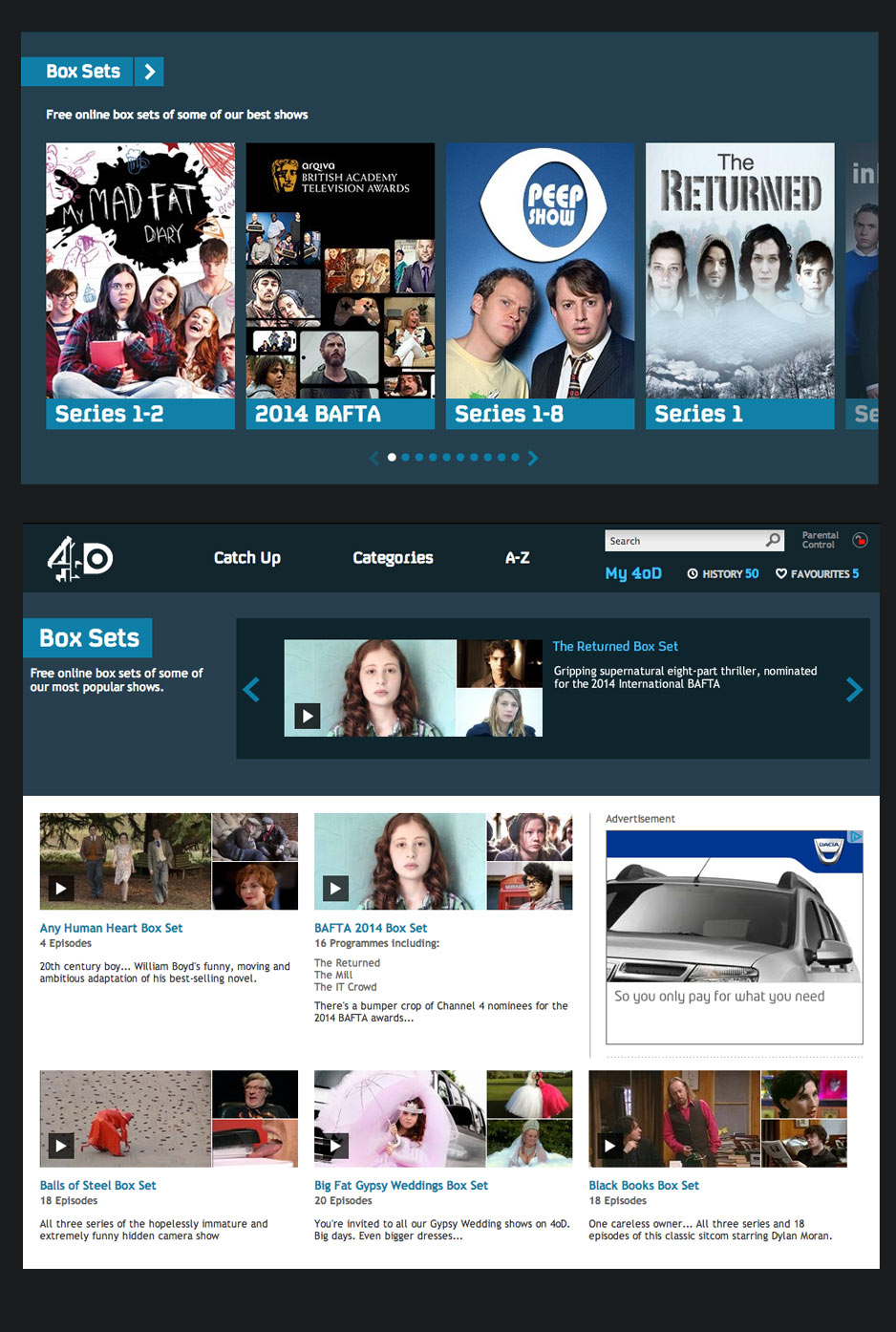
4oD has 1000's of hours of archive content that few users know about. We decided to change this by labelling this content as boxsets. Visually using portrait images and the darker background we make this section stand apart from the rest of the page. The flatter design style was again taken through to the boxset index page.
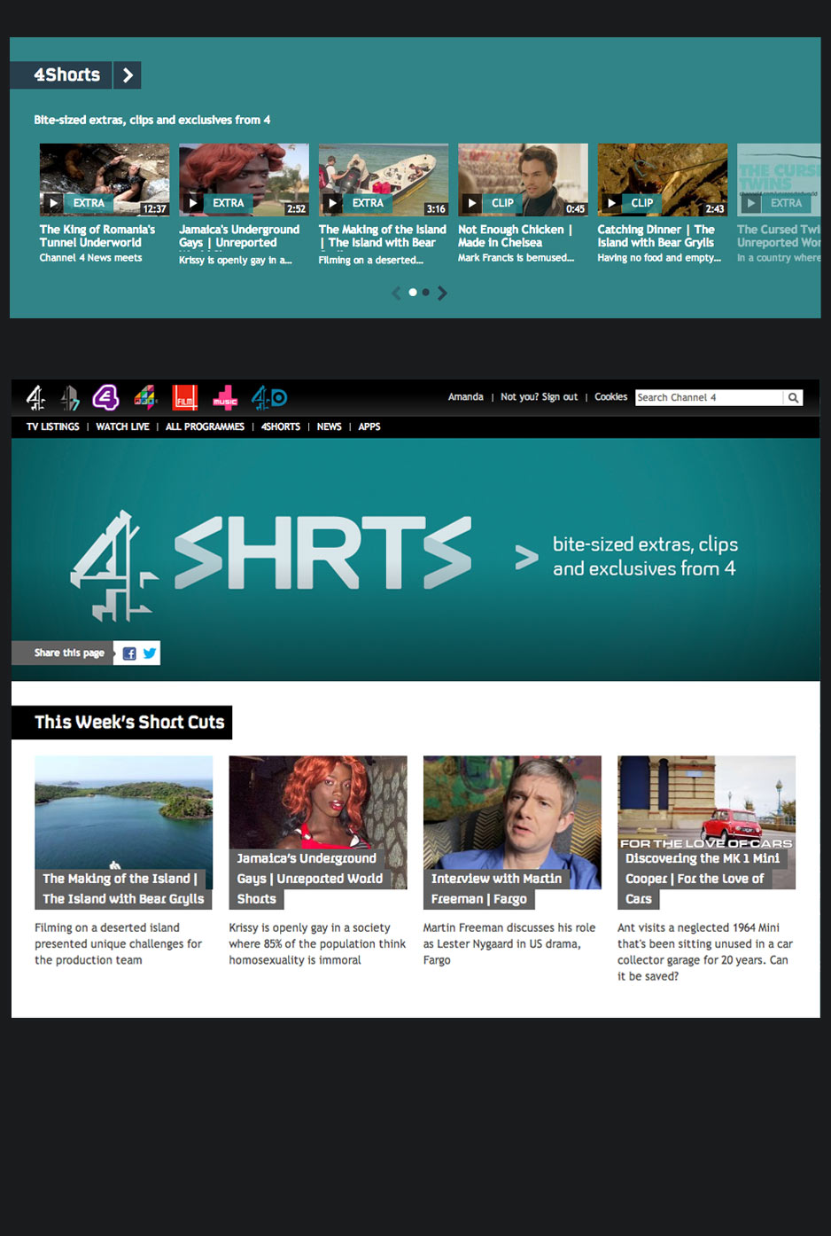
Another type of content we wanted to showcase on the new 4oD homepage was our new Short Form content. Again the background colour allowed this section to stand apart.
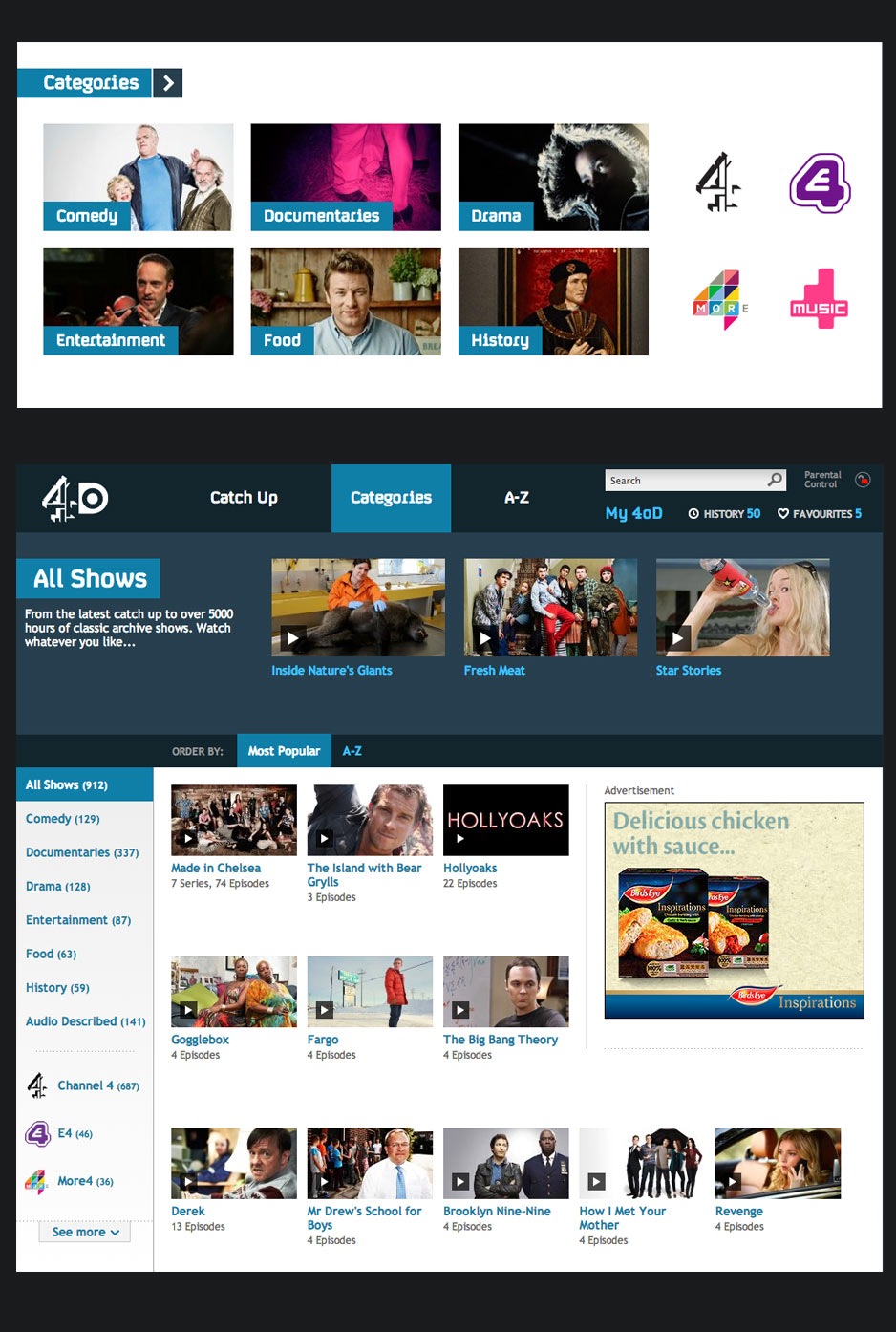
Finally at the bottom of the page we provided a user with a click link into the genre or channel of their choice. Again the index page design has been flattened for consistency.
