Logo Redesign
Client: Electronic Art
I worked as a senior designer for EA Store, as part of my job I had to review the existing customer experience, usability, functionality and navigation for the site. During this process I realised how out of date the logo was and I decided to try and update the design to fit more in line with the corporate portfolio.

An updated identity
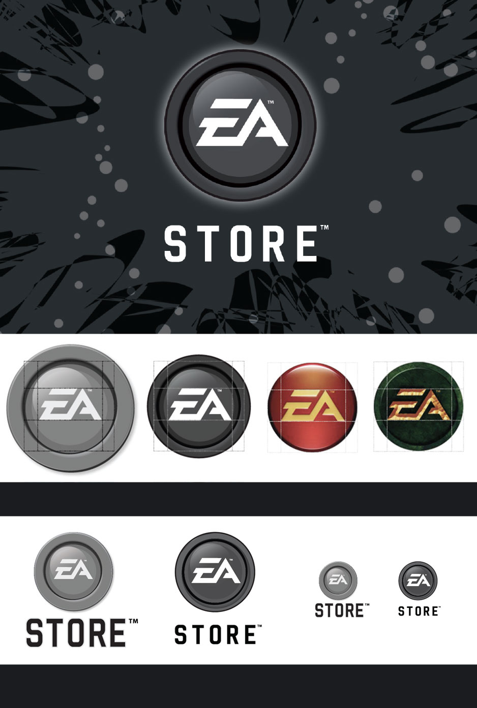
Every EA Signature Logo has the same basic structure. By using the Official Logo (right column, centre) as a template when building a Signature Logo, consistency is ensured.
With the current EA Store logo this same process was applied. However due to the design of the ‘button’ logo the size of the ‘button socket’ is quite large resulting in a much larger logo than other EA roundels.
When you compare the existing logo (top right) with the new logo (top left) the difference in size is obvious. The new logo takes the existing ‘button’ design and makes the ‘button socket’ smaller and more compact thus bringing it more in line with other EA Signature logo’s
The most defining characteristic of any Signature logo including EA Store’s is the EA trademark. When we scale down the current logo the most recognisable part becomes unnecessarily small but only because of the existing design.
The new logo (on the left) has the EA trademark in white instead of light grey. This along with the smaller ‘button socket’ area allows the EA trademark to stand out more when compared with the existing logo.
By also reducing the size of the word store in the new design we introduce a visual hierarchy. The EA trademark becomes the first thing you see. This is very important for consumer recognition and because the logo will always appear along side an E-commerce call to action a consumer does not need to see the word store any larger.
A harder working identity that is easy on the eye
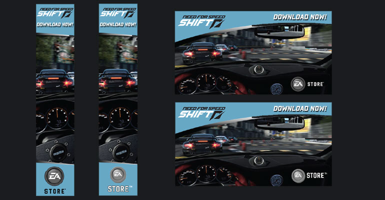
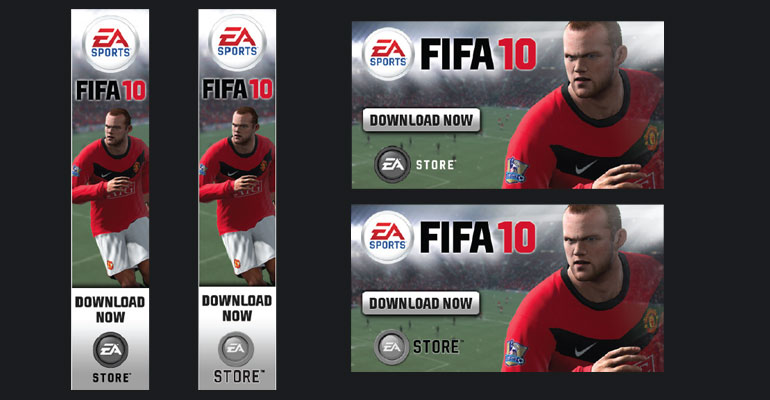
As you can see from these examples. The new logo even at the smallest of sizes was easier to read on various product advertising banners. EA now is the most prominent aspect of this logo with the word 'store' being read second.

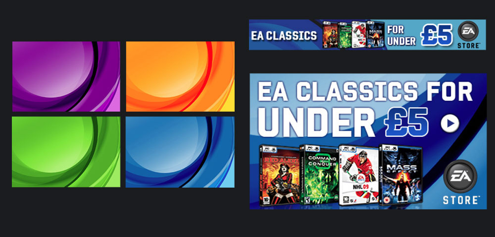
The start of a brand
When communicating generic EA Store messaging a consistent look and feel was needed to help s user to identify the difference between an EA Store led promotion and a single title promotion. I created four different coloured backgrounds to be used for EA Store multi title promotions using the new logo as inspiration.

