Logo and brand design
Client: Imperial College LondonDate: March 2019
A hard working identity
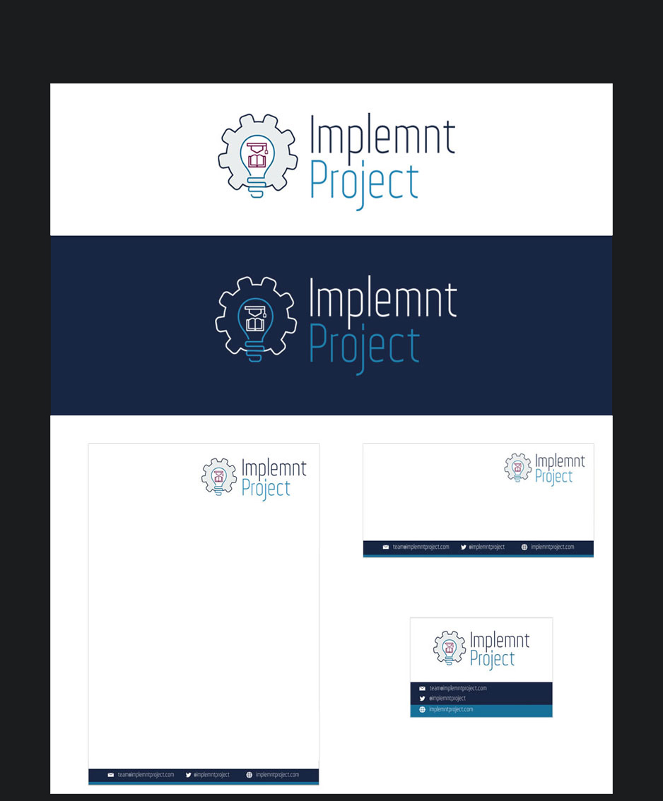
The logo idea for the Implemnt Project was one of innovation, the lightbulb moment that any one who has a good idea comes to them. The harder part was making the different aspects of the project come to together. How do you illustrate learning, how do you, in a logo show that it is a part of something bigger...
The mortar board and book were a reflection of the old style of teaching, putting this inside the light bulb hopefully shows this project is a different twist on traditional ways.
The cog that holds those elements together was the important aspect, it holds a minor but necessary part in a larger idea. The project logo is no good on its own and needs the other original resources to create this powerful teaching tool.
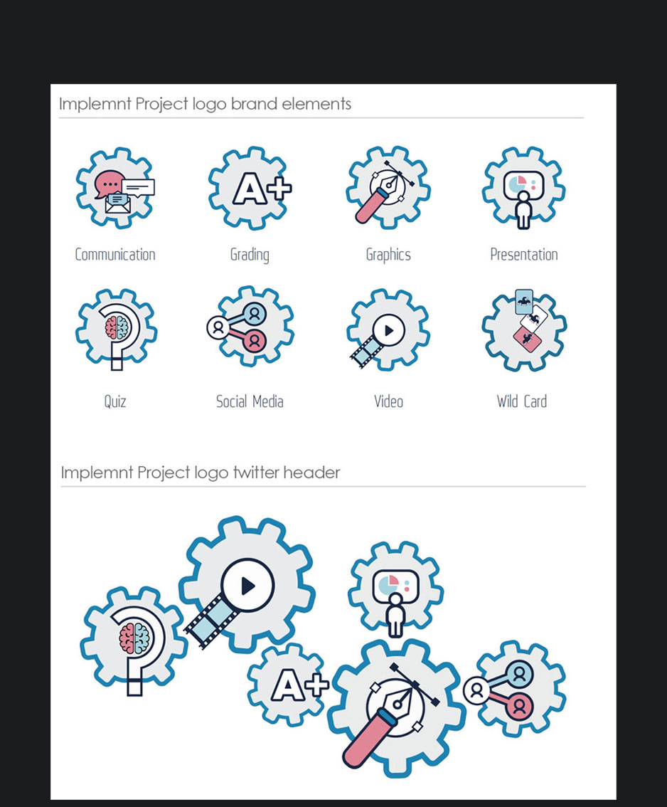
With eight diferent subjects that the project focuses on I wanted to create eight different cog images that could all work together or stand alone separately.
The hardest part was making sure that the main subjects illustrated had some part sticking out of the centre of the cog to act as one of the teeth. Without this they wouldn't follow the same pattern as the main logo which has the bottom of the light bulb doing the same thing.
The subtle change of the dark blue for the main cog outline being changed to the lighter blue was done from a visual hierarchy perspective. The dark blue is such a part of the London Imperial College brand, I wanted to use it sparing and only for the main logo.
I have put the full guideline document here for those interested.

